
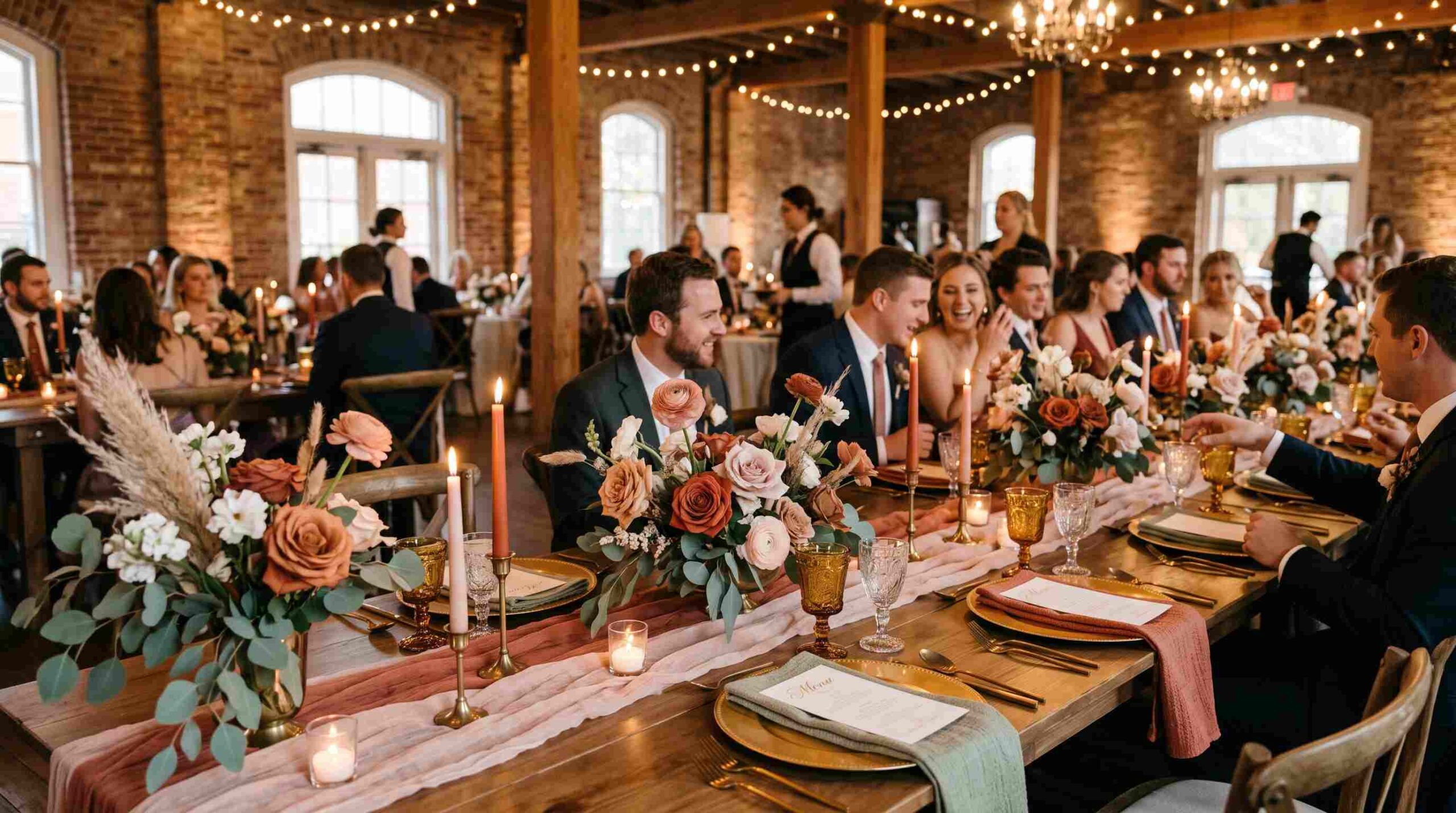
Picking wedding colors ideas can feel overwhelming when you’re staring at a thousand Pinterest boards and don’t know where to start. The truth is, a palette you’ll actually love usually comes from somewhere personal — a favorite flower, the season you’re marrying in, or even the color of your partner’s eyes. This guide walks through practical wedding colors ideas that work in real venues, real lighting, and real budgets.
Start With the Season
Season is one of the easiest filters for narrowing things down. Spring weddings lean toward soft pastels — blush, lavender, and sage green — while summer celebrations can handle bolder, sun-soaked tones like coral, turquoise, and marigold. Fall naturally pulls toward burgundy, rust, and burnt orange, and winter often looks stunning in deep jewel tones like emerald, navy, and plum.
If you want to see how real color theory applies to design choices like this, the Pantone Color of the Year page is a great reference — many couples build their palette around that year’s trending shade.
Classic Combinations That Never Go Out of Style
Not every couple wants a trendy look, and that’s completely fine. Some of the most timeless wedding colors ideas are the simplest: ivory and gold, navy and white, or dusty rose and sage. These combinations photograph beautifully and age well in your album, so you won’t look back in ten years feeling like your choices are dated.
Classic palettes are also easier to shop for. Bridesmaid dresses, linens, and florals in these shades are widely available, which can save you time and money compared to chasing a hard-to-match custom tone.
Bold and Unexpected Pairings
If classic isn’t your style, bold wedding colors ideas are having a real moment. Think jewel-toned combinations like emerald and gold, or moody pairings like black and deep red. Color-blocking — using two or three strong, contrasting shades instead of blending soft tones — is another popular direction for couples who want their day to feel like a design statement rather than a traditional event.
For inspiration on how bold pairing works outside weddings too, Adobe’s color wheel tool is a handy external resource for testing complementary and contrasting combinations before you commit.
Matching Your Palette to the Venue
Your venue plays a bigger role in your final colors than most people expect. A rustic barn with exposed wood naturally suits earthy tones like terracotta, cream, and olive green. A modern ballroom with marble and gold accents pairs beautifully with jewel tones or a monochrome look. An outdoor garden wedding usually looks best with colors that complement, rather than compete with, the greenery already around you.
Before finalizing your wedding colors ideas, it’s worth visiting the venue — or looking closely at photos — to check wall tones, lighting, and existing decor so nothing clashes on the actual day.
Bringing It Into Florals and Decor
Once you’ve settled on a palette, the next step is translating it into physical elements: florals, linens, bridesmaid dresses, groomsmen ties, and table settings. A common approach is the 60-30-10 rule borrowed from interior design — 60% of your decor in a primary color, 30% in a secondary color, and 10% as an accent. This keeps the final look feeling intentional instead of chaotic.
Florists are a great resource here too. Many will recommend in-season flowers that naturally match your chosen shades, which also helps keep costs down since out-of-season blooms tend to be pricier. If you’re budgeting the rest of the day alongside your decor, our wedding planning checklist can help you keep everything on track in one place.
A Note on Color Psychology
Color psychology is a fun, slightly lesser-known angle to consider. Blue is often associated with trust and calm, making it a popular choice for setting the overall mood. Red and burgundy tend to evoke passion and warmth. Green, especially sage and olive, signals growth and renewal — fitting for a new chapter in life. You don’t need to take this too seriously, but it can add meaning to your wedding colors ideas rather than picking shades purely on trend.
Tools to Help You Visualize Your Choices
If you’re still unsure which direction to go, digital moodboard tools can help bring your ideas to life before you spend money on samples. Pinterest remains the go-to for most couples, but dedicated palette generators like Coolors let you build and test full color schemes quickly — especially useful when you’re trying to picture how three or four shades will look together. You can also use our free color palette generator tool to quickly test combinations before sharing them with your florist or planner.
Final Thoughts
At the end of the day, the best wedding colors ideas are the ones that feel like you, not the ones trending this month. Start with a season, consider your venue, decide whether you want classic or bold, and don’t be afraid to mix in a personal touch — a color from your first date, your favorite flower, or a shade that just makes you happy. Your palette doesn’t need to impress anyone but the two of you.


